Overview
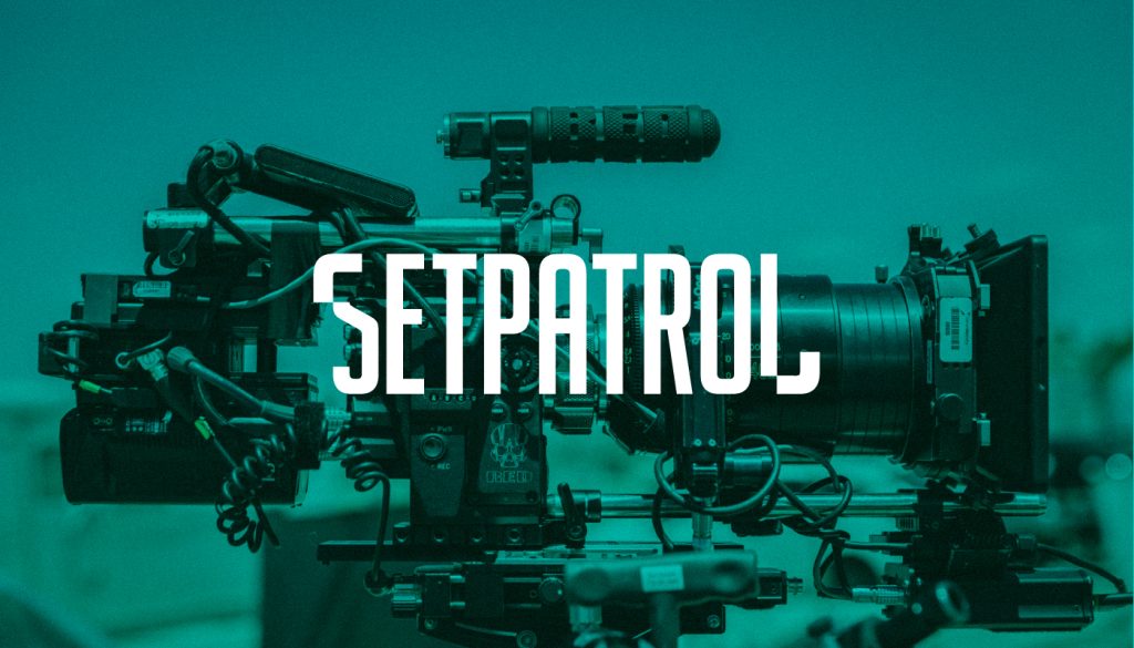
SetPatrol is a secured and vetted online platform that allows content creators to rent and buy equipment from peers. Its main mission is democratizing the film industry one rental at a time.
Project duration
March 2020 – May 2020
My role
Art Director
As the Art Director spearheading a comprehensive branding project for a dynamic startup, I embraced the challenge of crafting a visual identity that reflected the brand’s essence. From the project’s inception to its culmination, my role involved ensuring every design choice resonated with the startup’s vision and values. From logo creation to selecting color palettes and defining typographic styles, every decision aimed at cultivating a distinctive and memorable brand personality.
The challenge
The challenge was to build the whole brand identity from the ground up, that positions the startup adequetly in a cross-section of worlds where the filming community and the peer-to-peer sharing meets.
The approach
As with most startups, a trailblazer attitude is almost a necessity, which requires a number of combined methods that might be a bit more extensive compared to a brand building set in conventional fields. In our case such methods where, for example, a broad research about the brand positioning, with surveys completed both from the filming industry and outside of it, market research of different levels of proffesionalism in the field, and the usual process of defining mission, vision, values, etc. .
Building the key element of the visual idenity, the logo, it was important to steer away from the cliché-s used in this field related to cameras with overused elements, but still have something that is deeply related and easily recognizable if spotted at a filming set, on a web platform, or in any setting for that matter. For the whole idenity, a bold and robust graphical language was applied, with a special focus on adaptability and modularity.

The Logo
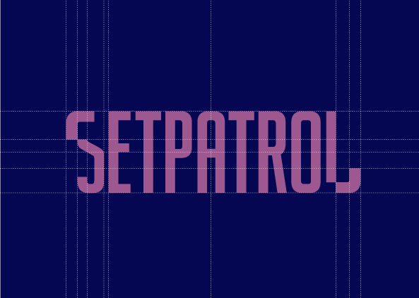
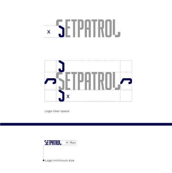
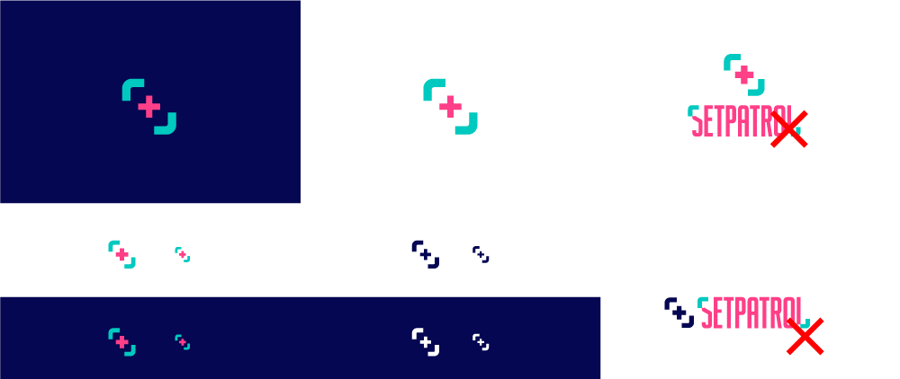
The SetPatrol logo is a powerful symbol, representing what the company stands for. The robust and fresh approach in the design reflects the brave attitude, shows a belief in standing our ground when it comes to our values and mission. It’s an evolution, which shows professionalism and trustworthiness. all while being embedded really well in the film industry. All of these values are embedded in the film industry using the initial idea of the previous logo, the bracket of the viewfinder, that is incorporated with the font.


The logo colors

Logo symbol and favicon
The brand colors
The choice of color palette reflects a deliberate fusion of emotion and intention. The primary blue anchors the brand with a sense of sophistication and depth, mirroring the startup’s profound values. Meanwhile, the other colors inject a vibrant and refreshing energy, turquoise and pink, symbolizing innovation and growth with a sense of daring creativity.

Typography
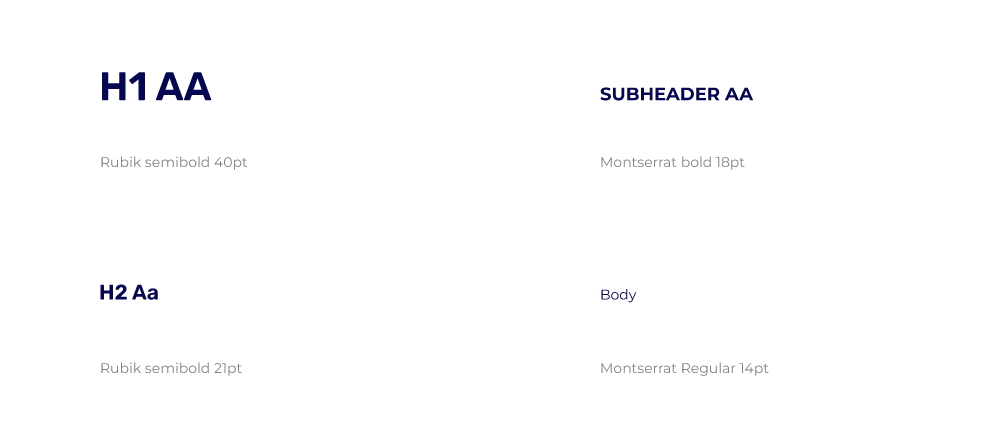
Rubik Semibold, with its clean lines and balanced proportions, exudes a sense of contemporary sophistication, aligning seamlessly with the startup’s forward-thinking ethos.
Montserrat’s versatility ensures legibility across various mediums, from digital interfaces to printed collateral, allowing the brand’s messaging to resonate effectively.
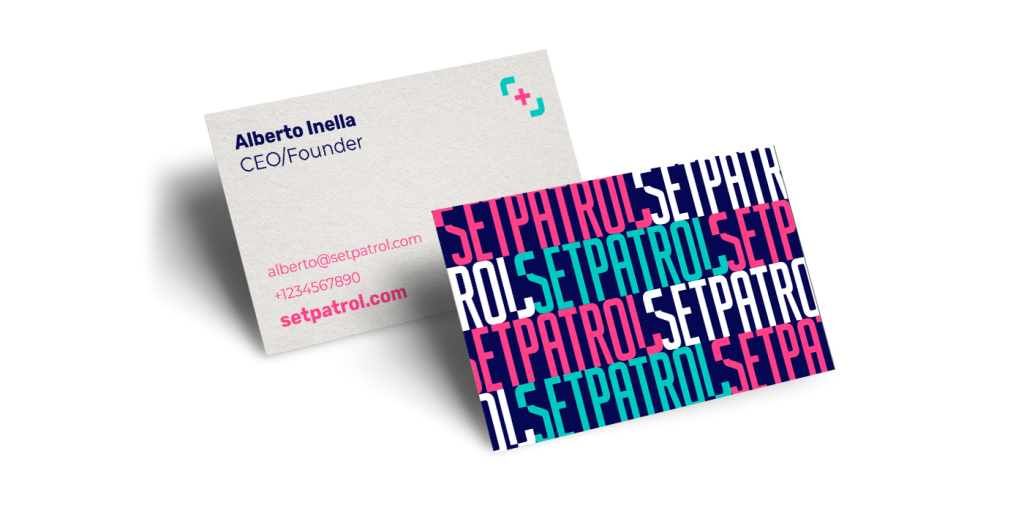
Business card
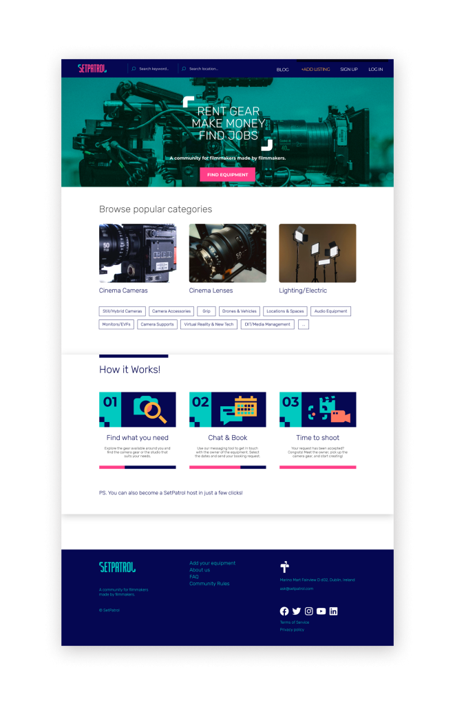
Website
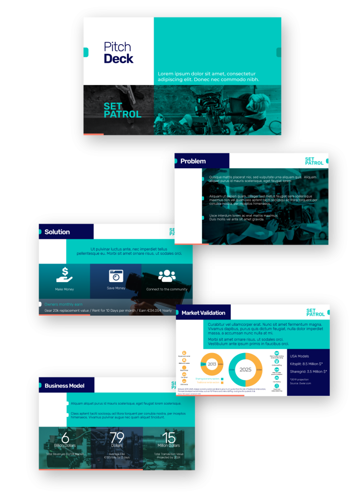
Pitch Deck
Conclusion
Steering the ship through the tumult of ideation, I conceptualized and refined the brand’s core identity, developing a cohesive narrative that would weave seamlessly across all touchpoints. This journey as an Art Director taught me the delicate balance of strategic thinking and artistic intuition, revealing the transformative power of design in establishing a brand’s unique footprint in a competitive landscape.
That’s it!
Thank you for checking out SetPatrol’s brand identity!
If you want to chat, feel free to reach out:
