Overview
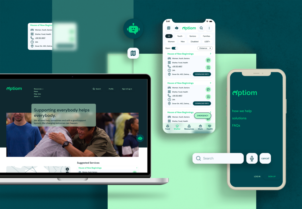
Optiom is a resource aggregator platform made with the goal to connect people in need with useful resources and services, focusing on the best problem solving method, which is preventing. Users are able to search and find services that fit their needs, with filtering by availability, type of services, etc., and through map or list view features. They can easily reach out to services in the app, by sending direct messages, or looking up their contact info shown on the service profile page. The app also features a news platform, where people can inform on useful tips and valuable information.
Designed for Real People in Real Situations
Optiom is a design exploration to a problem that raises the question “Are we sure that an app would be our best solution?”. My prior assumptions were that this has very little to do with mobile phones and apps, but that changed when – through user research – I found that a user base would be actually quite considerale in numbers on a platform like this.The platform prioritizes clarity, simplicity, and accessibility, ensuring that even users in crisis can navigate it effortlessly and stress-free.
Project duration
August 2023 – September 2023
My role
UX designer, leading the app and responsive website design from conception to delivery.
My responsibilities included conducting competitive research, interviews, paper and digital wireframing, low and high fidelity prototyping, conducting usability studies, iterating on designs, building information architecture, and responsive design.
The problem
In 2022, 95.3 million people in the EU (22% of the population) lived in households experiencing at least one of the three poverty and social exclusion risks: risk of poverty, severe material and social deprivation, and/or living in a household with very low work intensity. When searching for solutions, the general approach was concentrated on prevention, as this is the most effective way to solve this complex social problem. Studies have shown that effective prevention is both flexible and connected, adapting to people’s needs by working effectively with other services. Other than that, prevention requires a sufficient housing supply in order to work well.
The goal
Considering the essential preventive factors, it was found that, with the right approach and focus, these can be integrated into an app, as features that will help people who are at risk of becoming homeless.
So the main goal was to create an app that connects users with services, in a flexible and effective way.
Understanding the user
- User research
- Personas
- Problem statements
- Competitive audit
- Ideation
User research summary
The starting point was the general data on at risk youth and people in need, on which I based my interview questions for a user research. This research involved interviews and surveys with homeless individuals and outreach workers who serve this population. Most interview participants said that they have access to smartphones, however the availability of devices and connectivity can be sporadic, and the app should be designed with this in mind. To create an effective and user-centered app, it is crucial to prioritize privacy, accessibility, real-time information, and user engagement while considering the diverse demographics within this community.
Personas
Bia
27, Ontario CA
Unemployed
Education: High School diploma
Family: Husband, 2 kids
I’m really stressed about the future, I can’t think straight, although I try to keep things together and think logically
BIO
Bia is a young mother with a family of 4. They are on the verge of becoming homeless, her husband lost his job and she worked as a full time mother. The reality that they might lose their home came abruptly, their funds won’t cover for another month of rent, so they are preparing and seeking out options to prevent becoming homeless.
Goals
- Find a stable and safe place for her and her children
- Be able to maintain hygiene
- Enough food for her family
- Keep in touch with helping people
- Seek out opportunities
Frustrations
- Not having good clothes for her children
- Not having nutritious food
- Finding a public shelter can be hard without knowing the directions
- Finding a job and caring for kids is a lot of work
Personality
- Organized
- Timid
- Responsible
- Protective
- Practical
Motivators
- Safety
- Equality
- Collaboration
- Honesty
- Prosperity
Bia’s Problem Statement
Bia is a young mother of 2 kids who needs a place where all useful info is gathered about NGOs (a reliable resource aggregator) because Her family needs to prevent becoming homeless.
Klaus
59, Richmond VA
Unemployed, Veteran
Education: Forklift Certificate
Family: Single
The worst thing is that you see the inevitable coming and there is so little you can do about it, but I’m a man, I can handle it
BIO
Klaus is a middle aged veteran, who, after a divorce, lost his place to live in. He is been a homeless for quite some time now. He changes location often, because he searches for occasional jobs, which can get scarce after a while in one location. He Usually seeks out public shelters to sleep, but because of not know the city he is in, it can be hard to find these places. He doesn’t use a smartphone, and he usually finds jobs directly from business owners, but when there isn’t any luck he goes to internet cafes to find opportunities on the web. Because of his state, sometimes he’s having mental breakdowns and close to depression, and he’s not immune to the addictive behaviors that a lot of homeless people face.
Goals
- Find a stable and safe place to sleep
- Be able to maintain hygiene
- Enough food
- Seek out jobs, occasional or part time
- Keep mental health at check
- Keep being sober
Frustrations
- Trouble finding a place to sleep
- Not having nutritious food
- Finding a job
- Having a knowledge about legal options one can take in one’s situation
- Reaching out to people for help is shameful
- No smartphone
Personality
- Resilient
- Resourceful
- Cautious
- Compassionate
Motivators
- Stability
- Earning dignity
- Connecting
- Honesty
- Overcoming addictions
Klaus’ Problem Statement
Klaus is a homeless veteran who needs To know where public shelters are and how to get there because He needs a shelter for the night.
Competitive audit
An audit of a few competitor’s products provided direction on gaps and opportunities to address with the app. Reviewing the competitors and the products that they offer was a really big help in understanding on what are they doing well and what could be done better. This examining informed the design process on how to approach the problem, and revealed possible gaps in the market that helped define the unique value proposition.


Ideation
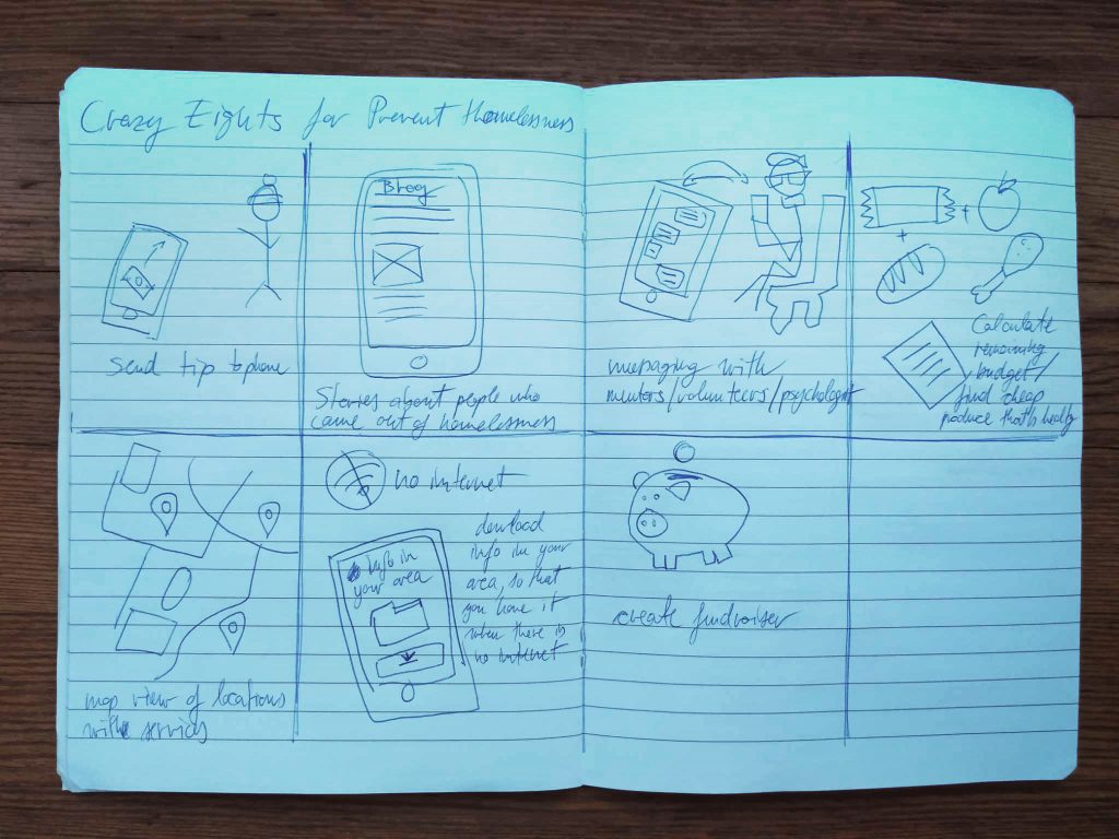
I conducted an ideation session(crazy eights) to generate potential solutions for addressing the shortcomings identified during the competitive audit, with a particular emphasis on enhancing accessibility features.
Starting the design
- Digital wireframes
- Low-fidelity prototype
- Usability studies
Digital Wireframes
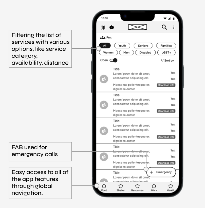
The next step was to create paper wireframes which were then converted to digital wireframes. These initial designs were focused on easy to use search and filtering, helping users find the best suiting service for their needs.
Low-fidelity prototype
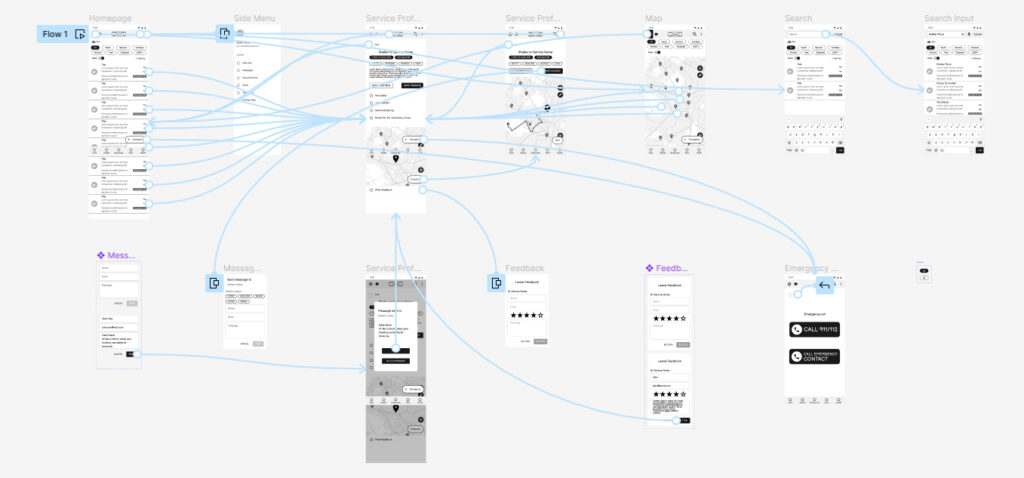
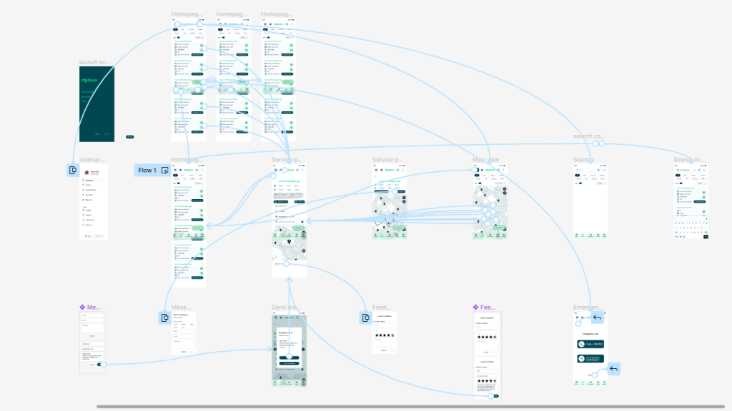
To prepare for usability testing, I created a low-fidelity prototype that connected the user flow of searching for services, reaching out and finding the directions to that selected service. These actions made up the main flow of the app.
Usability study
Parameters:
Study type:
Unmoderated
usability study
Location:
Europe, remote
Participants:
6 participants
Lenght:
20-30 minutes
Findings:
Connectivity
Considering the availability of internet connection, it was a very important for users to have access to information even when there is no internet traffic.
Search and filtering
All participants mentioned the importance of filtering for their specific needs when looking for services, including a map view for easier wayfinding.
Reaching out
Both people at-risk and people who work at helping services mentioned that it’s beneficial if there is more then one or two ways to connect with each other.
Accessibility & Usability at the Core
From high-contrast design to easy-to-read typography, Optiom is built for everyone, including those with visual impairments or limited digital literacy. Minimal input, clear navigation, and real-time updates ensure a smooth, frustration-free experience.
Refining the design
- Design System
- Mockups
- High-fidelity prototype
- Accessibility
Design system
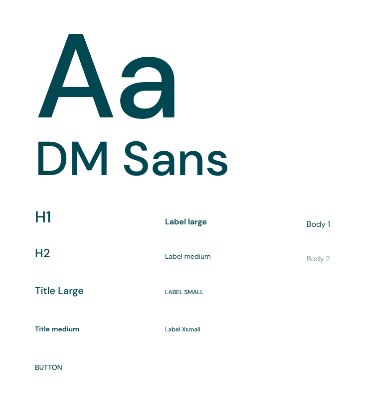
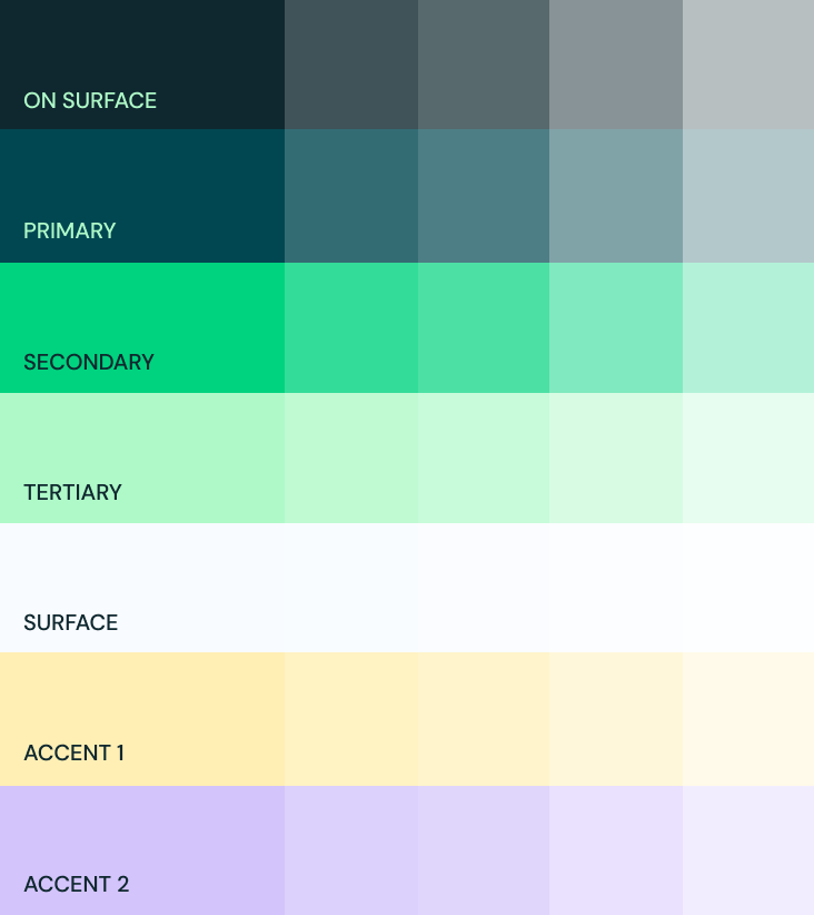
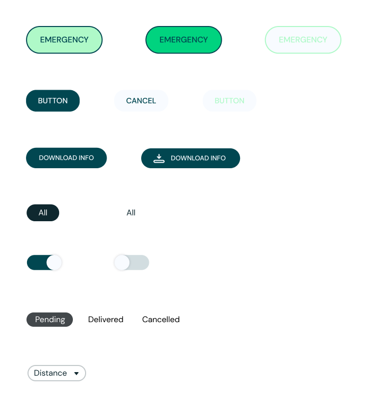
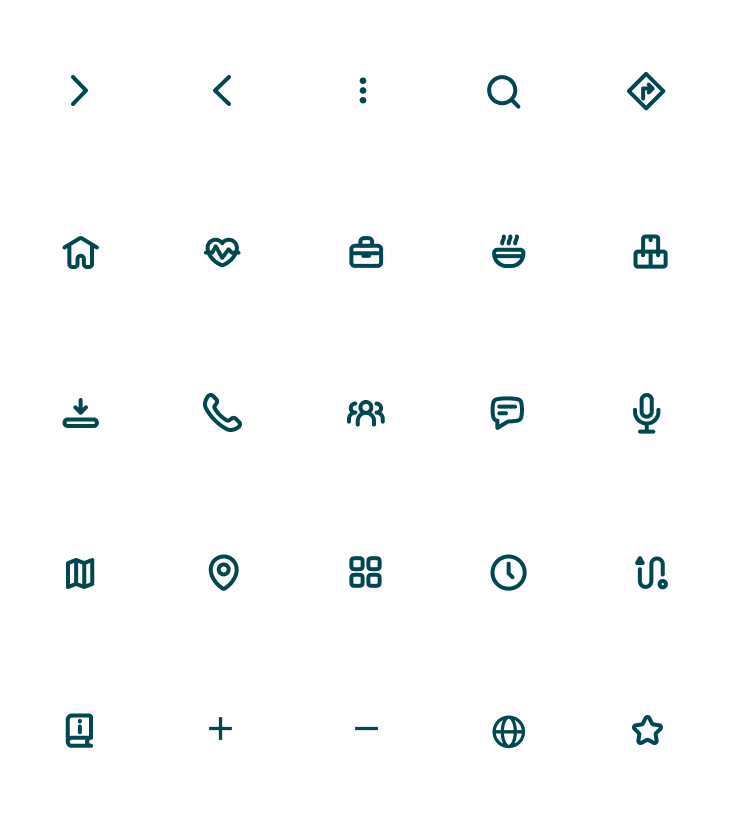
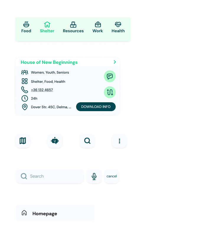
During the design phase, it was important to consider the core functionalities and solutions, as well as the values and mission that the app represented. Making sure that the colors, typography and components reflect the general idea was at main focus. Some keywords that helped to remain in theme were Safety, Health, Nature/Growth, Reassuring. The color palette with a green primary and its variables was the prefect choice to express these values. As for the typography, DM Sans seemed to be a good choice, taking advantage of its modern clarity, legibility, consistency, and versatility.
Mockups
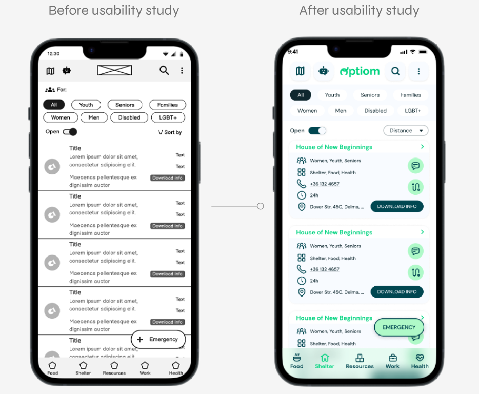
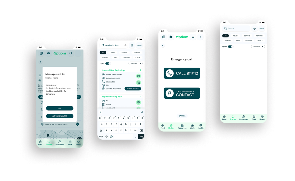
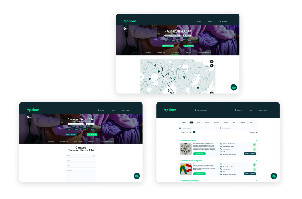
Based on the insights from the usability studies, I applied design changes like providing a more clear way to send message, find the directions, and to download information on services.
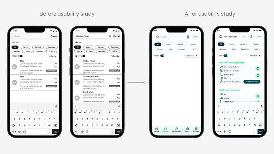
Additional design changes included adding a voice input method for searching, with a microphone icon next to the text input field.
On the initial wireframe designs there was a list of recommended services displayed before any search was typed in. This was removed since it was confusing for most users.
High-fidelity prototype
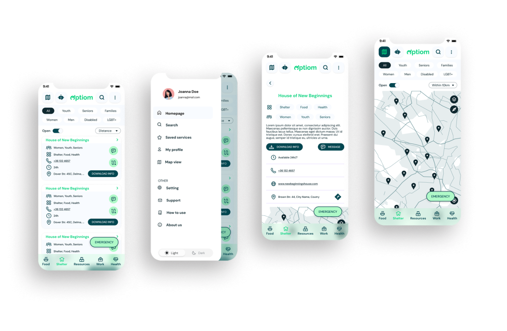
The high-fidelity prototype followed the same user flow as the low-fidelity prototype, including design changes made after the usability study.
Accessibility considerations
1
Available information even when there is no internet connection.
2
Battery saving options, such as dark mode or battery save mode.
3
Clear labels for interactive elements that can be read by screen readers. Also text reader as well as voice typing options.
Responsive design
- Information architecture
- Responsive design
Sitemap
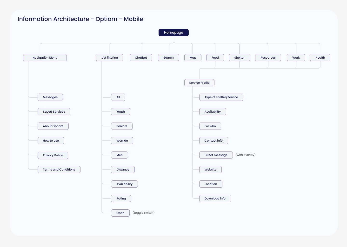
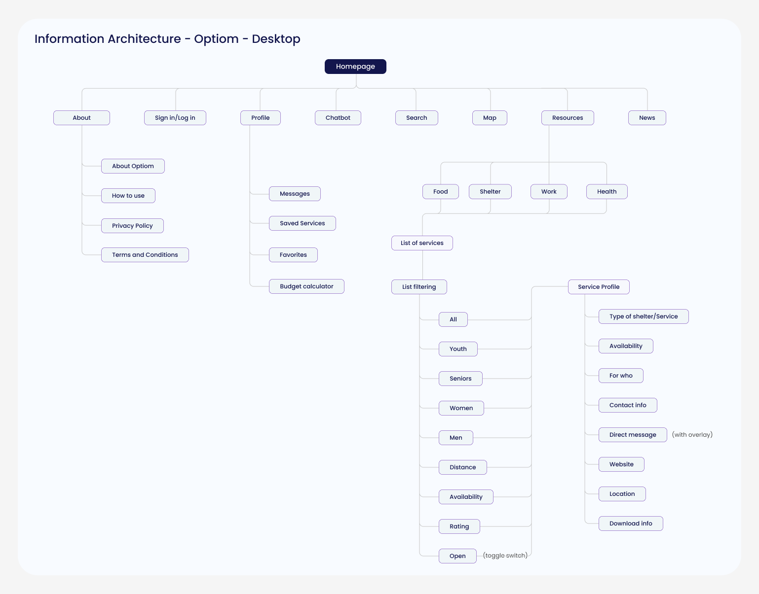
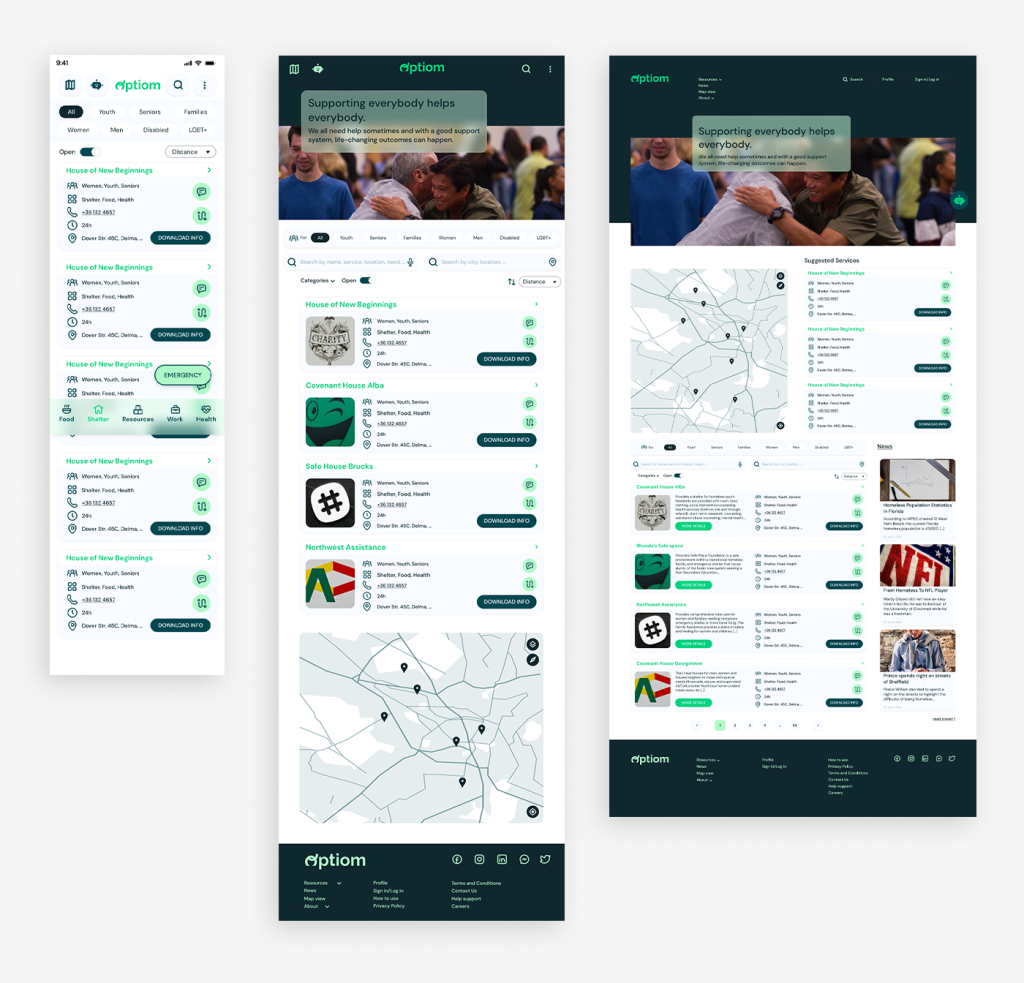
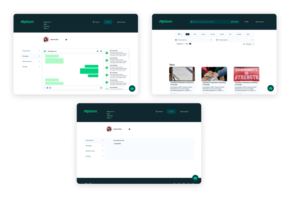
With the app designs completed, I started work on designing the responsive website. I used the Optiom sitemap to guide the organizational structure of each screen’s design to ensure a cohesive and consistent experience across devices.
Responsivity
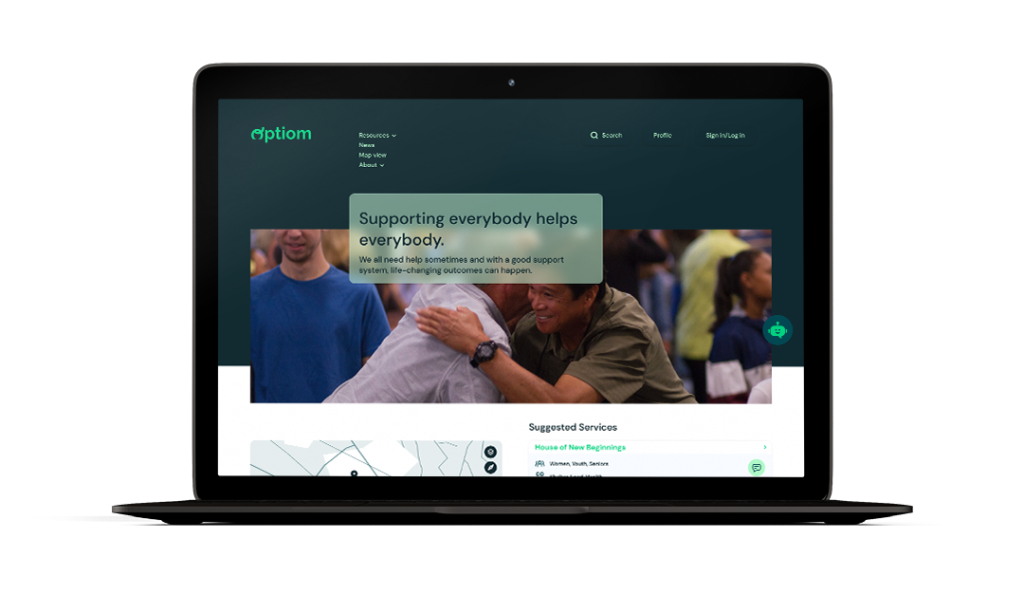
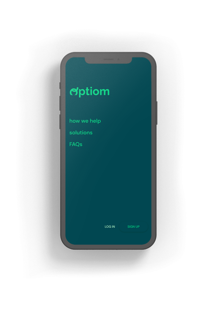
Since the availability of devices and connectivity can be sparse when it comes to the target users, accessing the app from various devices and platforms was crucial. The design process followed a progressive enhancement method, implementing the mobile-first philosophy. Additionally a tablet and desktop version was made as well, since a good number of users will access the platform from internet cafes and similar places, without a smartphone. I optimized the designs to fit specific user needs of each device and screen size.
Going forward
- Takeaways
- Next steps
Takeaways
Impact
Overall the users shared that the app made searching and finding helpful resources easy to do. This way of reaching out made the process more engaging, but also users felt secure and felt that the method was internal. One quote from peer feedback was that “It’s so good to see something like this in today’s world. Sometimes you feel like everybody has forgotten about you, but this thing tells me that that’s not always the case. It’s also easier to use than I thought!”
What I learned
I learned that this topic and the problem behind it is really complex. Further than that, the target audience in this field prioritizes privacy, accessibility, real-time information, and user engagement. Last but not least, the demographics in this community is actually really diverse, which should be considered going forward.
Next steps
1
Conduct research on how successful the app is in reaching the goal to connect people-in-need with services.
2
Improve on searching methods and connecting features, like messaging.
3
Implementing an improvement system with feedbacks and ratings could potentially help services learning what people at risk need.
That’s it!
Thank you for your time viewing my work on the Optiom app!
If you want to chat, feel free to reach out:
