Overview
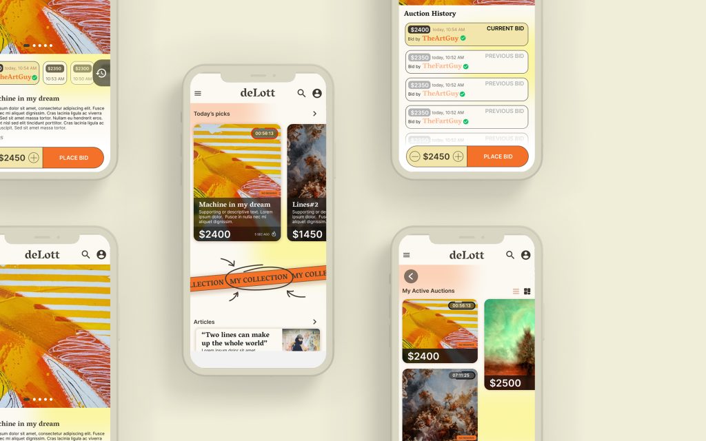
deLott is a gallery and auction house located in central Europe that specializes in fine art, folk and world art, and antiquities. Next to their in-house auctions held at their gallery, they wanted to offer a streamlined online auctioning experience to their wide spectrum of clients.
User-Centered Design for Art Collectors
DeLott’s platform is crafted with a deep understanding of art collectors’ needs, offering comprehensive details for each artwork and time-saving features. This ensures that both seasoned collectors and newcomers can make informed decisions efficiently.
Project duration
March 2023 – June 2023
My role
UX designer
Conducting interviews, paper and digital wireframing, low and high-fidelity prototyping, conducting usability studies, accounting for accessibility, and iterating on designs.
The problem
In the evolving landscape of online art auctions, we recognize a pressing need for an innovative and secure platform that addresses key challenges faced by art enthusiasts, collectors, and sellers. Current issues such as concerns over authenticity, security risks, lack of market transparency, high transaction fees, limited accessibility, and the need for integrating emerging technologies highlight a gap in the market.
The goal
Our aim is to develop an art auction app that offers a seamless user experience, striking a balance between affordability and profitability, while embracing emerging technologies to enhance curation, provenance tracking, and user engagement. By addressing these challenges, our goal is to build a trustworthy and accessible marketplace that fosters a vibrant community of art enthusiasts and facilitates fair and efficient transactions in the online art market.
Understanding the user
- User research
- Personas
- Problem statements
- User journey map
User research summary
To better understand users needs, goals, frustrations, and pain points, I’ve conducted a short session of interviews and created empathy maps. This research revealed two main user groups with distinct characteristics and differences.
This was really close to the initial assumptions, where these groups are differentiated by their attitude towards artworks, but also showed new insights, such as common issues at both user groups, like — for their own reasons — to have a details section for each art piece.
Based on these two user groups I’ve created the personas, that’ll help define similar themes and patterns of behaviors, and how to define and solve common pain points.
Pain Points
Time
Art represents a really important section in the life of the interviewed users, however it’s still important to keep a balance between interests. That’s why it’s important that the app brings time saving solutions.
Details
Art without its context is incomplete, no matter where the observer is coming from. Having a well layed out details section next to artworks, as well as a news or blog type of informative page, where users can stay up to date with the art world, would be very beneficial.
A11y
Visuality is very important when it comes to art, but some people have difficulty with it, so accessibility is very important. Screen readers with alt text could help solve these problems. Also, having a lot of images with artwork details, as well as AR tech would give useful insights to help make decisions.
Personas
Carlos
59, Graz, A
Business owner
Education: Technical school
Family: Married
If you want to find treasure, you have to dig the hole yourself. But in the end it’s worth it.
BIO
Carlos is a professional art collector, who buys and sells art on a regular basis, and specializes in rare folk art. He appreciates art not only for it’s cultural, but for its material, resale value as well. He wants to discover new pieces and stay up to date in the art world, but he’s really busy running his own business. Plus, over time his vision got weak, so an app that gathers all the necessary info and delivers it in an accessible way would be a great help. He uses art auctions more as an investment opportunity.
Goals
- Make good long term investments that are low risk and not volatile
- Catch good deals on the art market
- Stay informed about the art world
Frustrations
- Don’t have time to research every piece
- Missing out on good deals
- Limited options to discover new talent or to inspect an art piece
Personality
- Approachable
- Curious
- A little reserved
- Confident
- Limited knowledge of internet
- Slightly forgetful
Motivators
- Pricing
- Convenience
- Honesty
- Time saving
Carlos’ Problem Statement
Carlos is a senior art collector and dealer who needs a tool to buy and sell art easily, while staying up to date in the art world because he wants to make good investments.
User journey map
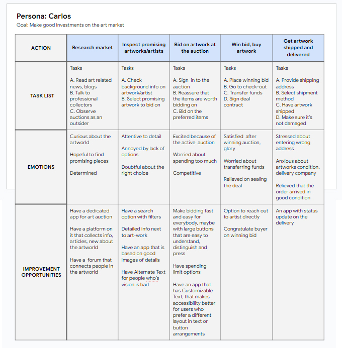
Mapping Carlos’ user journey revealed how helpful it would be for users to have access to a dedicated deLott art auction app.
Starting the design
- Paper wireframes
- Digital wireframes
- Low-fidelity prototype
- Usability studies
Paper wireframes
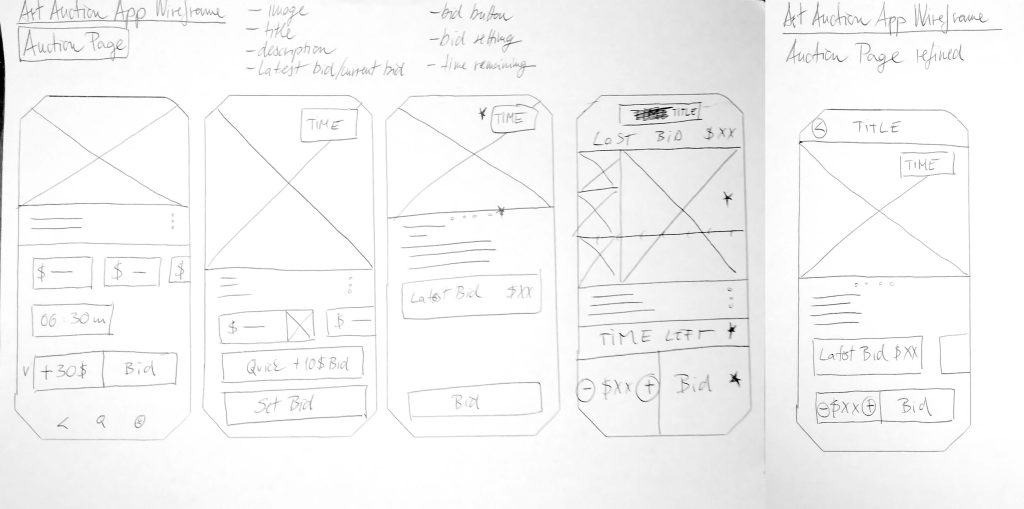
Creating wireframes on paper was a fast and easily adjustable way to lay out ideas. Also, it ensured that the elements that were crucial for the main user flows are included, in a way that they solve key pain points.
In this example, I sketched out the auction page, focusing on the features that are the most useful for the user. 4 initial ideas for the auction page, and a refined version, where the most useful features were combined.
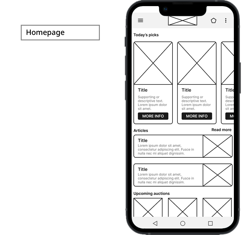
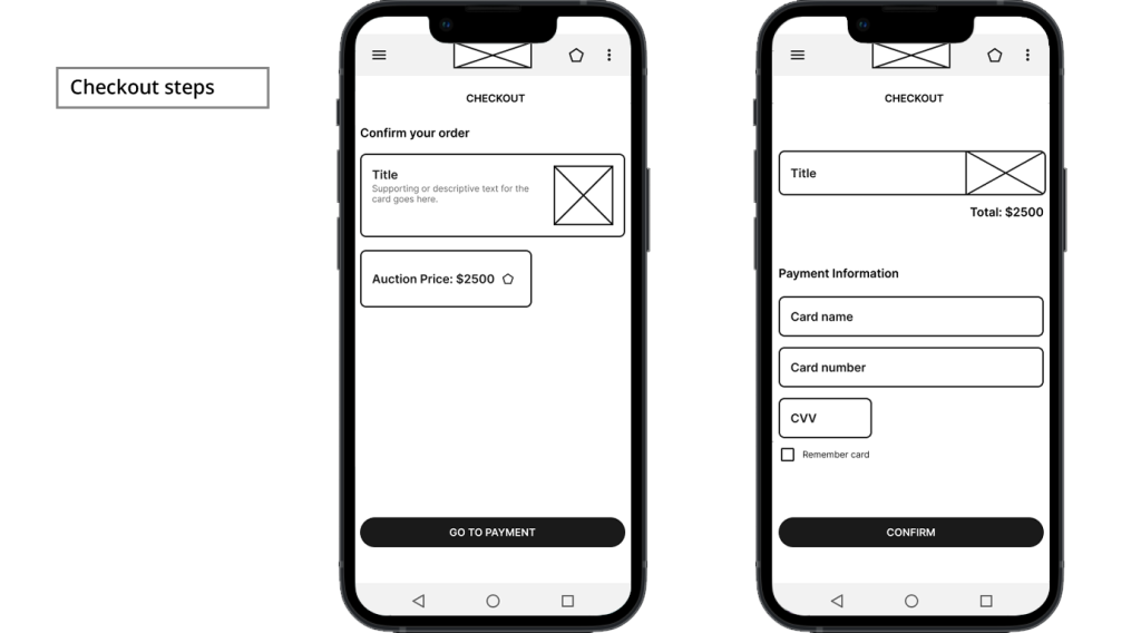
Digital Wireframes
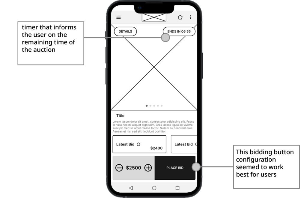
Digital wireframes were created after the paper wireframes were refined, based on feedback and the findings of the user research.
Low-fidelity prototype
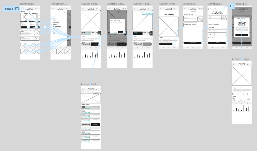
Using the completed set of digital wireframes, I created a low-fidelity prototype. The primary user flow I connected was bidding and winning on an auction and going through the checkout process, so the prototype could be used in a usability study.
Usability study
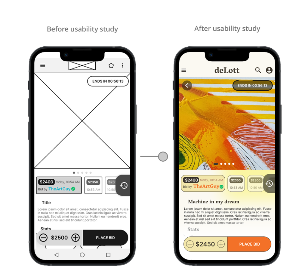
To have a seamless main user flow and to make sure that the components in the user interface are working the best way possible, I conducted two rounds of usability studies. The findings from the first study helped guide the designing of wireframes, mockups and prototypes. The second usability study helped to test the HiFi prototype and refine it.
Parameters:
Study type:
Unmoderated
usability study
Location:
Europe, remote
Participants:
5 participants
Lenght:
20 minutes
Round 1 findings:
Users want to know exactly how much time is left from the auction
Users want to know as many details about an artwork as possible
The checkout process needs to be easy flowing
Round 2 findings:
The “My Auctions” button is confusing
The top nav bar should stay fixed on scrolling
Bidding should be customized with options such as manual input or set increment units
Accessible and Inclusive Art Experience
Recognizing the diverse user base, deLott integrates accessibility features such as screen reader compatibility with descriptive alt text and high-resolution imagery. These elements make the art auction experience inclusive, catering to users with varying visual abilities and ensuring that art is appreciated by all.
Refining the design
- Mockups
- High-fidelity prototype
- Accessibility
Mockups
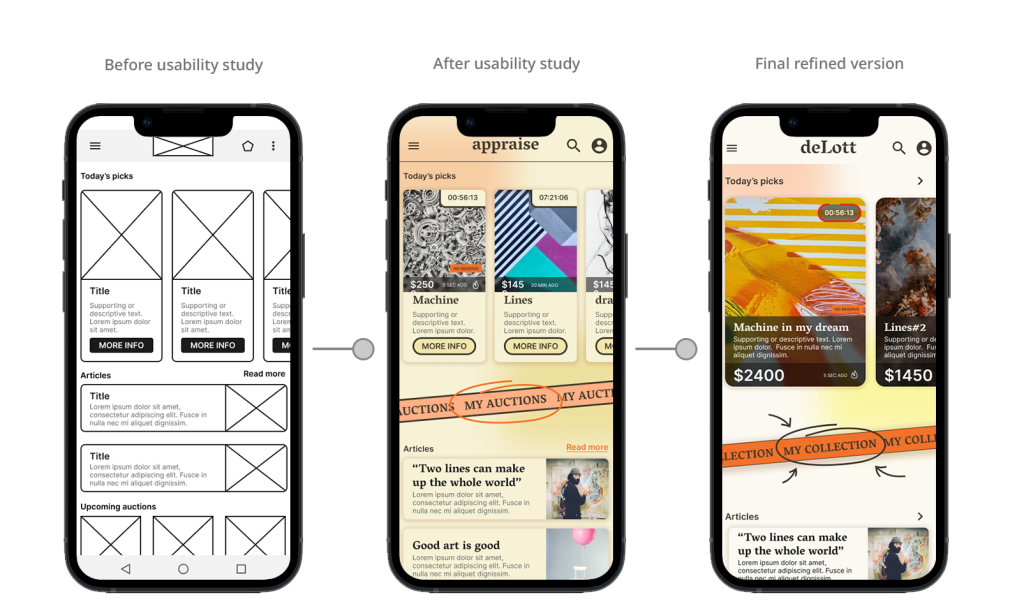
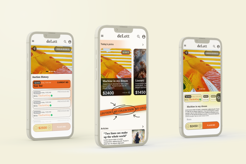
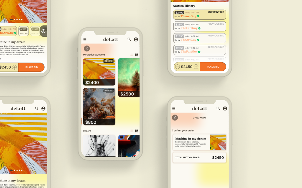
In the early concepts, the cards of the ongoing auctions were too small and narrow, so I made adjustments to the design so that the info on the cards can be more extensive, making it easier for the users to choose.
A “My Auctions” button was added to the Homepage, so that users can access their art portfolio from a place that is close to the thumb area.
In the Auction page, we can see a section that shows a preview of the bid history, which was updated after the first round of usability study, where it’s scrollable to the right, but also tapping the history “clock” icon opens an extended list view of the bid history on the art piece.
The fixed bidding button was also refined so that it’s fitting for the overall design.
High-fidelity prototype

Accessibility considerations
1
I payed attention on proper color contrast between elements on a screen that correspond to the standards of WebAIM. This was a great opportunity for equity design where this a11y consideration aimed the visually impaired also helps people who use the app in less ideal circumstances like in bright sunlight or other bothering factors.
2
Easily read fonts were also a conscious decision. In my design system I chose fonts and font pairings that are easy to read for everyone. I also considered a font aesthetic that doesn’t distract from the main UX elements but suits the overall visual identity of app such as this one.
3
Other A11y considerations included focus states on interactive elements, copy content that is easily understood by everyone, visual hierarchy, iconography, etc.
Going forward
- Takeaways
- Next steps
Takeaways
Impact
Overall the users felt that the app would be a well functioning and really useful tool for participating in auctions online thanks to its features and helpful informations.
Quote from peer feedback:
“It’s all there, all of the things I’d like to know and do when I’m planning to get a piece, is right here under my thumb”
What I learned
While designing the art auction app for deLott, I learned that the design process is very iterative, it’s an ever changing process where flexibility and constant updates are key. It was fascinating to see how insights from usability studies influenced each iteration of the app’s designs, making it better with each revision.
Next steps
1
Conduct another round of usability studies to validate whether the pain points users experienced have been effectively addressed.
2
See if there are any new features or aspects that the app should have, probably with the help of a round of user research.
3
Discover other possibilities for the overall visual brand.
That’s it!
Thank you for taking the time to check out my case study on the deLott app!
If you want to chat, feel free to reach out:
