Overview
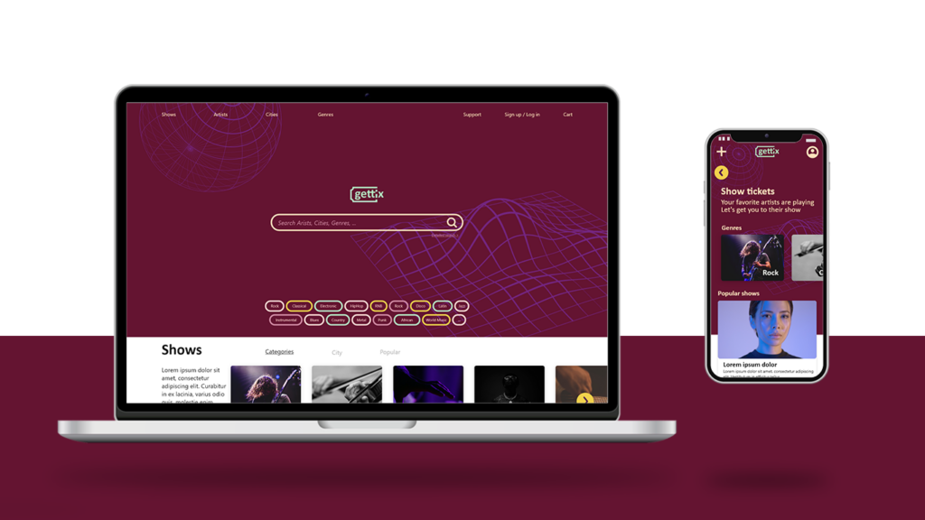
Gettix is a music venue ticket ordering website that focuses on streamlining the user experience for people who want to just order tickets to concerts that they like, without any complicated process. It focuses on users between 25 and 60 years of age, who want to go to concerts that they like, on time, with their friends and loved ones.
User-Centric Design for Stress-Free Ticketing
Gettix addresses common frustrations in online ticket purchasing by offering a clean and intuitive interface. By eliminating clutter and simplifying navigation, users can effortlessly browse and select concerts, reducing the stress often associated with ticket buying.
Project duration
June 2023 – July 2023
My role
UX designer, responsible for the process of designing the website from start to finish
Research, including competitive audits, defining user problems through interviews, paper and digital wireframing, low and high-fidelity prototyping, conducting usability studies, accounting for accessibility, iterating on designs and responsive design.
The problem
The existing concert ticket-selling websites suffer from cluttered designs, ineffective product browsing systems, and perplexing checkout processes.
The goal
Create a user-friendly and visually captivating website that provides music enthusiasts with a seamless ticket-buying experience. For this it’s important to simplify the browsing and ticket selection process, with the possibility of purchasing multiple tickets, making it effortless for users to find their favorite concerts and events.
Understanding the user
- User research
- Personas
- Problem statements
- User journey map
User research summary
I conducted user interviews, which I then turned into empathy maps to better understand the target user and their needs. Through these findings I realized that buying tickets can be an exciting process for the users, but handling the tickets and getting to the venue on time, finding the seats can be stressful at times.
Pain Points
Navigation
Considering the availability of internet connection, it was a very important for users to have access to information even when there is no internet traffic.
Experience
Entering a venue can be stressful, considering how easy it is for something to go wrong and not being able to present the tickets. So it’s important to have tickets and important infos to have a good concert experience.
Access
Music venues are often held at unfamiliar places, which can cause confusion or even missing a concert.
Personas
Shane
40, Prague, Cz
Veterinarian
Education: BA
Family: Girlfriend
Timing is really important, when you go to show. Either you’re there on time or you miss the whole thing
BIO
Shane is a vet who loves to go music venues with his girlfriend, it’s their biggest common interest. They also like to go with friends sometimes, to events that are nearby. Buying tickets in group sometimes can be a big responsibility, this frustrates him, but he is the one to handle it usually. Shane is an amputee, so when going to venues it’s important to find a good parking spot, in an ideal walking distance from the gates.
Goals
- Have meaningful experience with friends and loved ones
- Get notified if there are interesting venues
- Handle group tickets easily
Frustrations
- Missing out on interesting venues
- Handling the responsibility of multiple tickets
- Not getting to the venue on time
Personality
- Organized
- Timid
- Responsible
- Protective
- Practical
Motivators
- Good experiences
- Pricing
- Convenience
- Honesty
- Time saving
Shane’s Problem Statement
Shane is a busy professional and music lover, who needs to easily find and purchase concert tickets online, because they want to go to shows that they like, on time, with their friends and loved ones.
User journey map
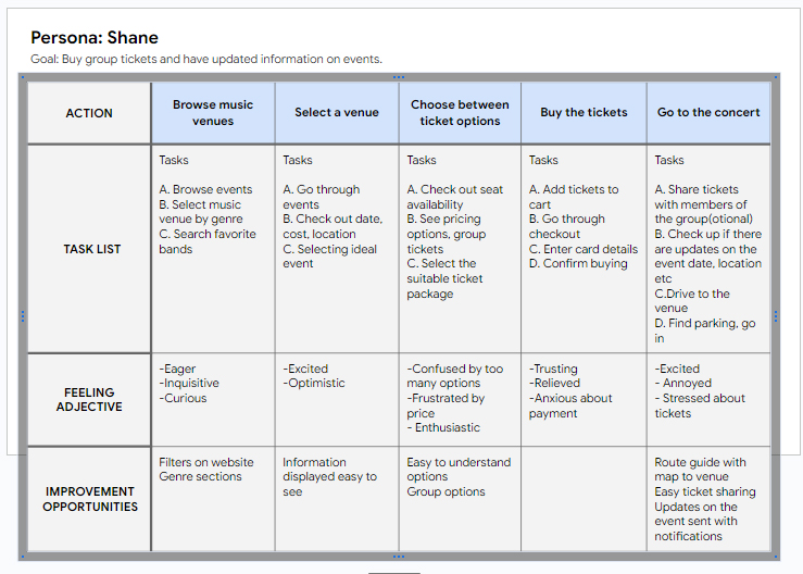
I created a user journey map of Shane’s experience using the site to help identify possible pain points and improvement opportunities.
Starting the design
- Sitemap
- Paper wireframes
- Digital wireframes
- Low-fidelity prototype
- Usability studies
Sitemap
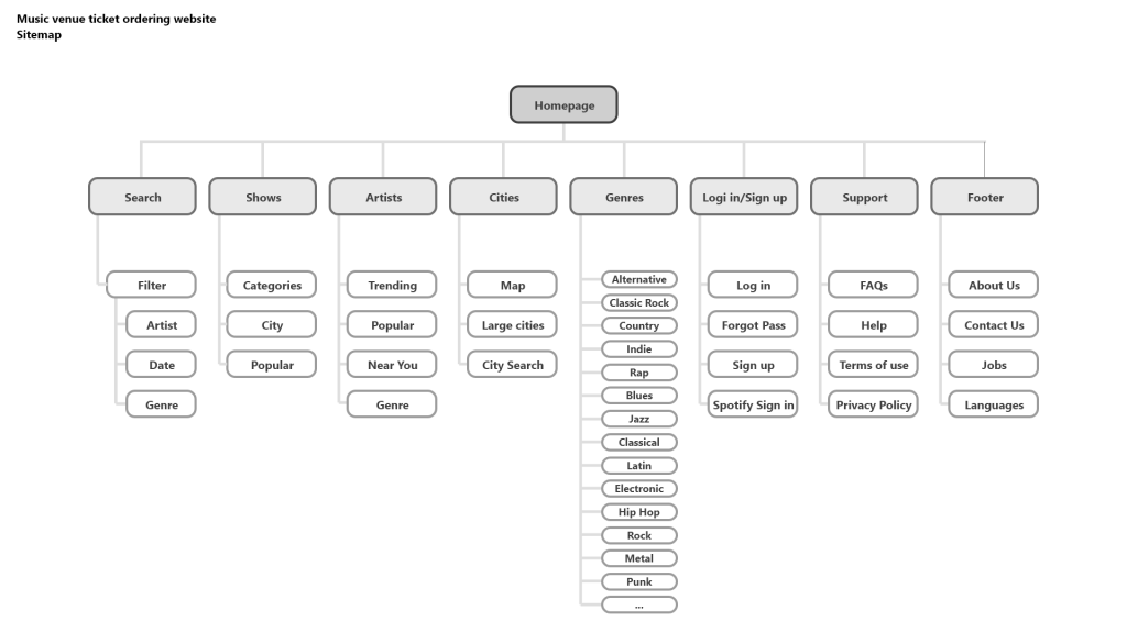
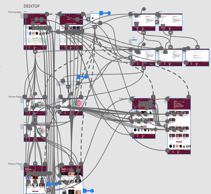
Considering the main pain points that the users face when buying tickets online, I layed out the sitemap in a way that it solves these issues, namely having a clean and simple navigation, yet providing all the necessary information.
Paper wireframes
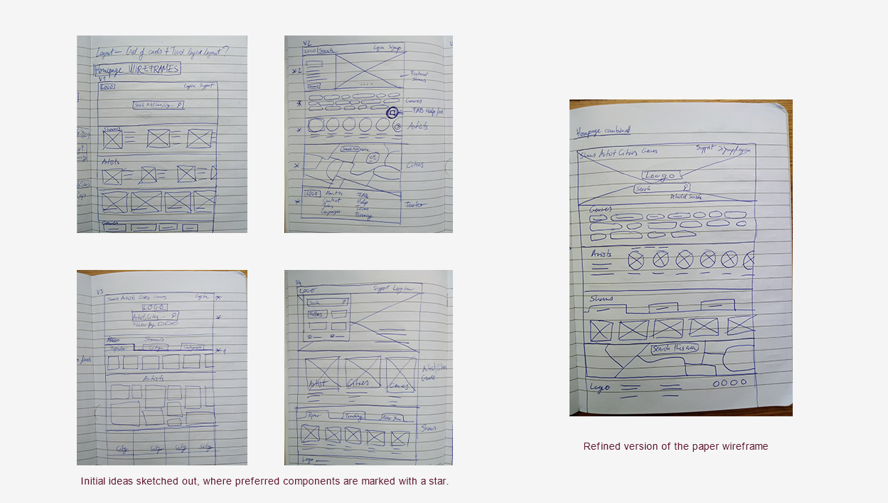
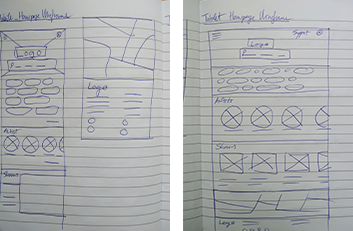
Next, I sketched out paper wireframes for each screen in my app, keeping the user pain points.
The home screen paper wireframe variations to the right focus on optimizing the browsing experience for users, inspired by the a way a search engine works.
Paper wireframe screen size variations
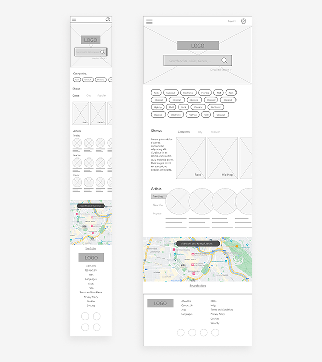
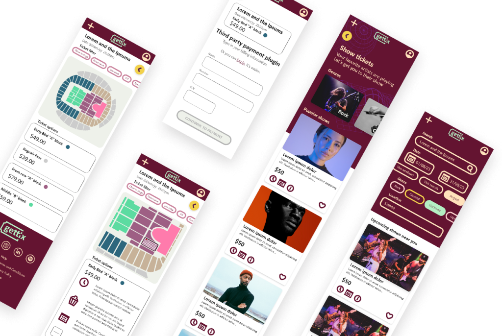
Because users are accessing online ticket selling websites from a variety of devices, I adopted the design to different screen sizes as well, like mobile and tablet, making sure that the website is fully responsive.
Digital wireframes
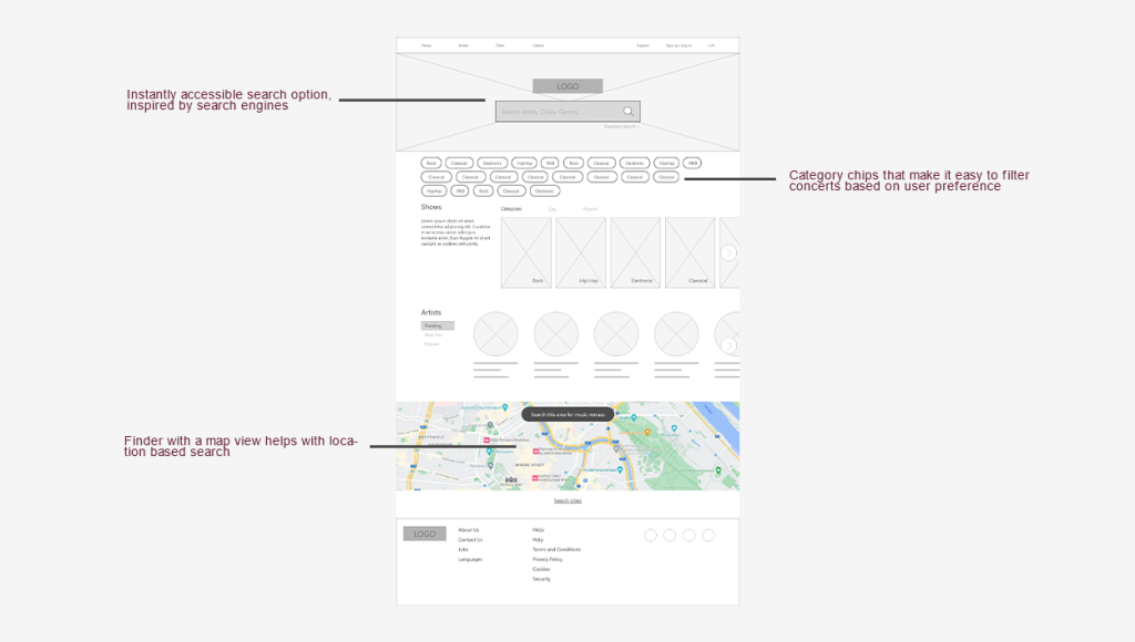
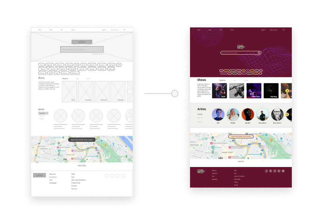
Focusing on useful button locations and visual element placement on the home page was a key part of my strategy.
Reducing visual clutter was important when making decisions on elements positioning.
Digital wireframe screen size variations
Low-fidelity prototype
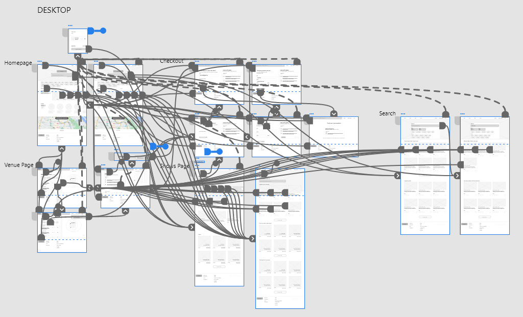
After creating the low fidelity prototype, I made sure to test it with a variety of users and implemented their feedback about things like placement of buttons and page organization.
Usability study
Parameters:
Location:
Europe, remote
Lenght:
20-30 minutes
Participants:
4 participants
Study type:
Moderated
usability study
Findings:
Search vs Navigation
Users preferred using the search option and the extended search with filtering options when it came to finding shows.
Group ordering
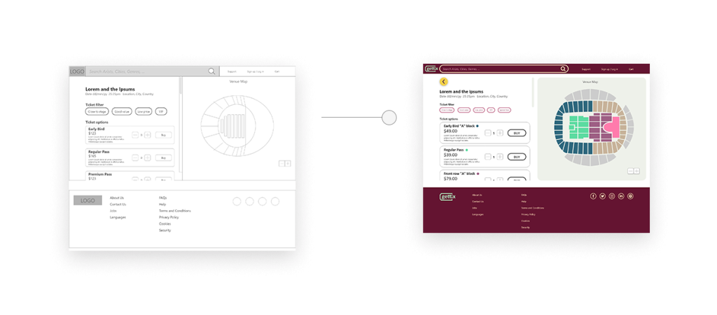
When ordering tickets, it’s important to have easy input options to increase the number of tickets purchased.
Options displayed
Considering that sometimes there are offer for group order discounts, it was important to display such options in a prominent way.
Accessible Information Anytime, Anywhere
Understanding that internet connectivity can be unreliable, Gettix ensures that essential ticket and venue information is accessible even offline. This feature empowers users to confidently manage their tickets and plans, regardless of their internet access at any given moment.
Refining the design
- Mockups
- High-fidelity prototype
- Accessibility
Mockups
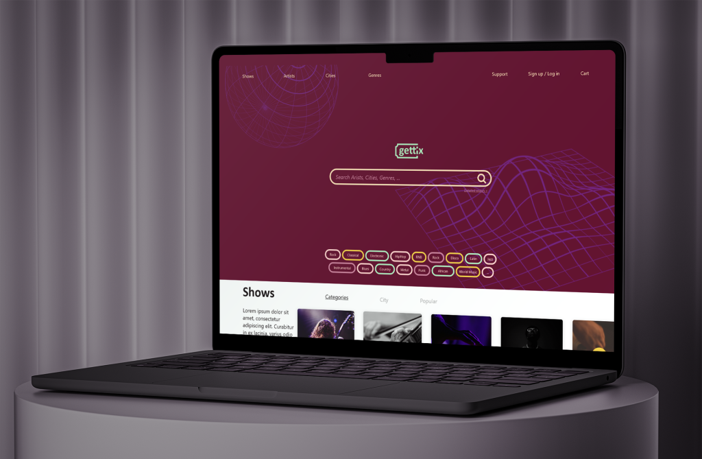
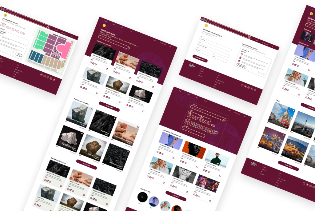
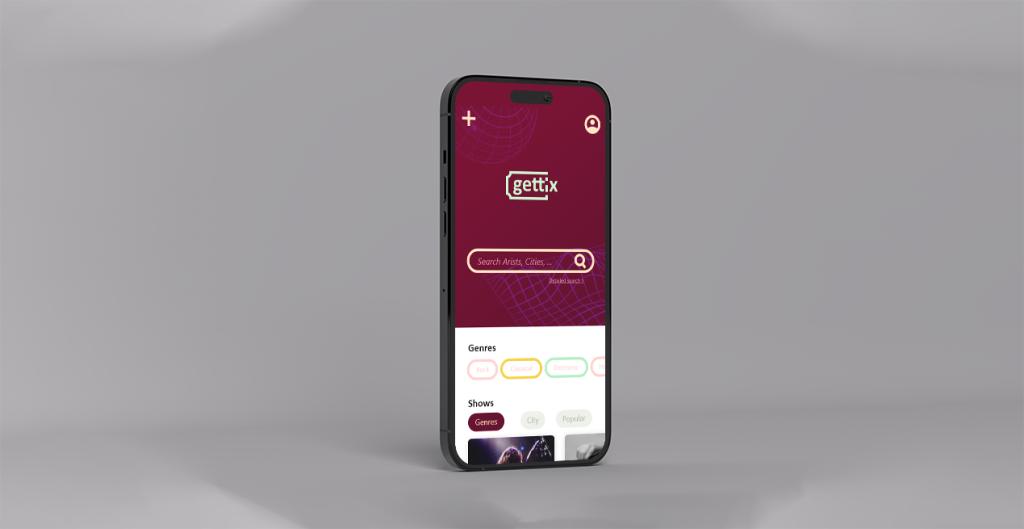
Based on the feedback received from the usability study, I used a very clean and minimal layout for the design, paying close attention to sections and components and how they are composition above and below the fold.
High-fidelity prototype
My hi-fi prototype followed the same user flow as the lo-fi prototype, and included the design changes made after the usability study.
Accessibility considerations
1
I used headings with different sized text for clear visual hierarchy.
2
I payed big attention to using good color contrast, and built a design system with colors that were checked with the WebAIM’s contrast checker. This way users, including users with visual disabilities, are able to perceive content on the page.
3
I used landmarks to help users navigate the site, including users who rely on assistive technologies
Going forward
- Takeaways
- Next steps
Takeaways
Impact
Users shared that the design was intuitive, clean and simple to navigate, and demonstrated a clear visual hierarchy.
What I learned
Through my experiences, I discovered that even minor design alterations can significantly influence the user experience. The key lesson I learned from this is to consistently prioritize the genuine requirements of the users when generating design concepts and solutions. Also, I realized the importance of learning to create with responsive design in mind. By embracing responsive design principles, I aim to craft websites that seamlessly adapt to various devices and screen sizes, ensuring an optimal user experience across all platforms.
Next steps
1
Conduct follow-up usability testing on the new website.
2
Ideate and implement new features, such as search and suggestions based on a music listened through music streaming services, or share tickets with friends.
That’s it!
Thank you for your time viewing my work on the Gettix app!
If you want to chat, feel free to reach out:
